BrandZee
BrandZee is a new brand by Müllerritzrow for employer branding and recruiting: it helps established companies reach Gen Z talent. The name and strategy were already in place, I was commissioned with the design, from the first moodboard to four routes, a shortlist and the final wordmark.

The task
Companies are struggling to reach young talent, and many “Gen Z agencies” sell themselves on being part of the target group, but lack experience. BrandZee answers that with a different promise: an experienced brand agency that connects with Gen Z.
Name, positioning and strategy had already been worked out when I joined. My brief was the design: a logo that stands on its own, independent of the Müllerritzrow brand, makes clear at first sight that it is about the young generation, and works above all digitally. The tricky part: the people visiting the website are HR and marketing leads at companies with 500+ employees, most of them not Gen Z themselves, and they still had to feel instantly that BrandZee “gets” Gen Z.
Research
I started with moodboards of brands Gen Z actually uses, in fashion, entertainment, finance and food, and with an audit of existing “Zee” names to see which visual territory was already taken. Two patterns stood out: very reduced, confident wordmarks, and loud, playful systems that live from colour and attitude.
That gave four directions to explore, each with its own typeface, palette and tone of voice.
Four routes
Every route was tested the same way: a website hero, an Instagram post, the round profile icon and the colour and type system next to each other. That made the routes easy to compare where it matters, in use rather than on an empty artboard.
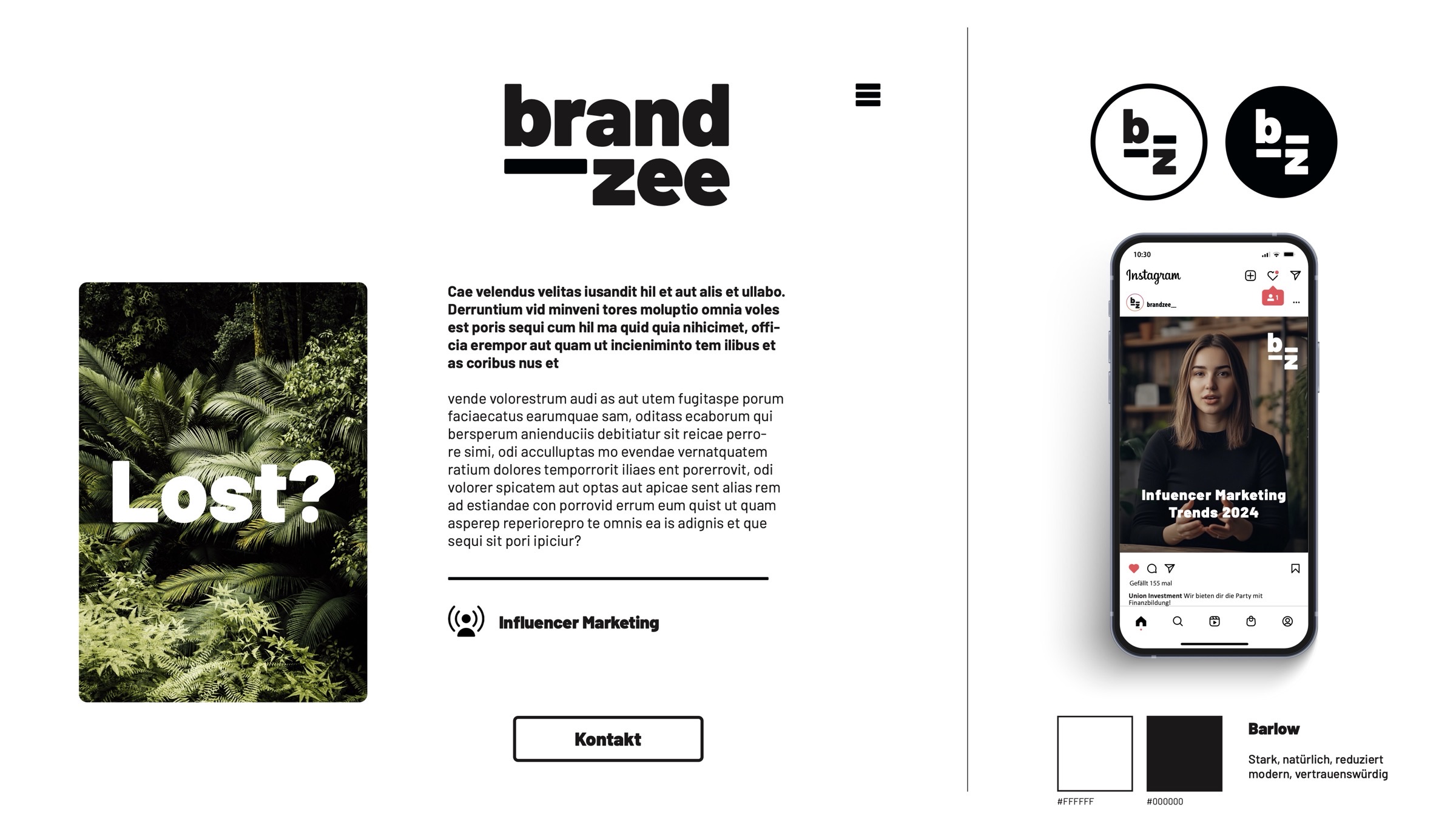
Bold and reduced
Extreme contrasts, black and white. “brand” sits on top of “zee”, the short stroke becomes the icon b_z.
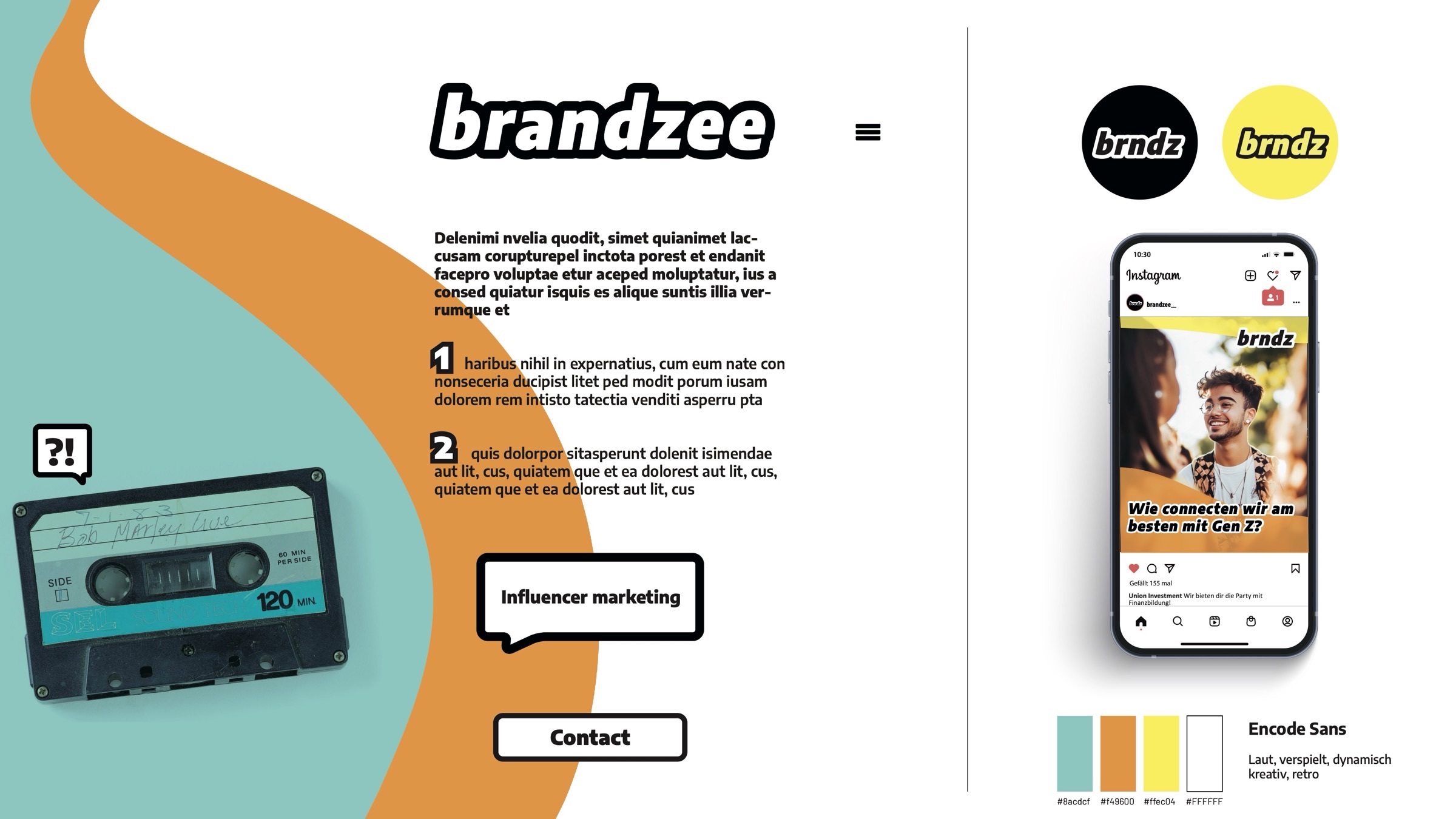
Loud and retro
Retro design with bold outlines, playful shapes and images in vibrant colours, a short form “brndz”.
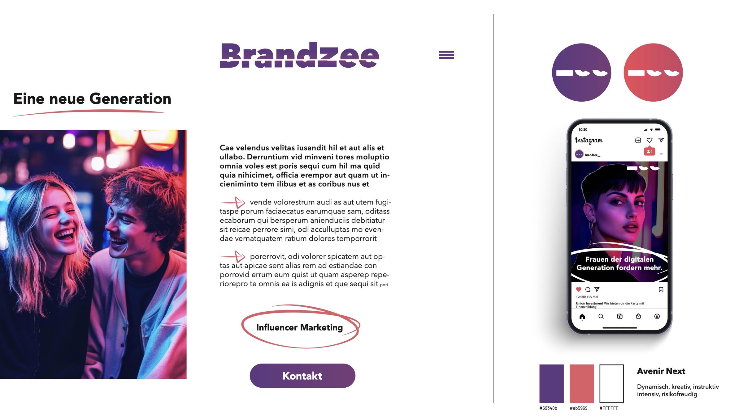
Dynamic and intense
Vibrant purple and coral gradients, a strong lighting theme, handwritten details and a “zee” that sits below the line.
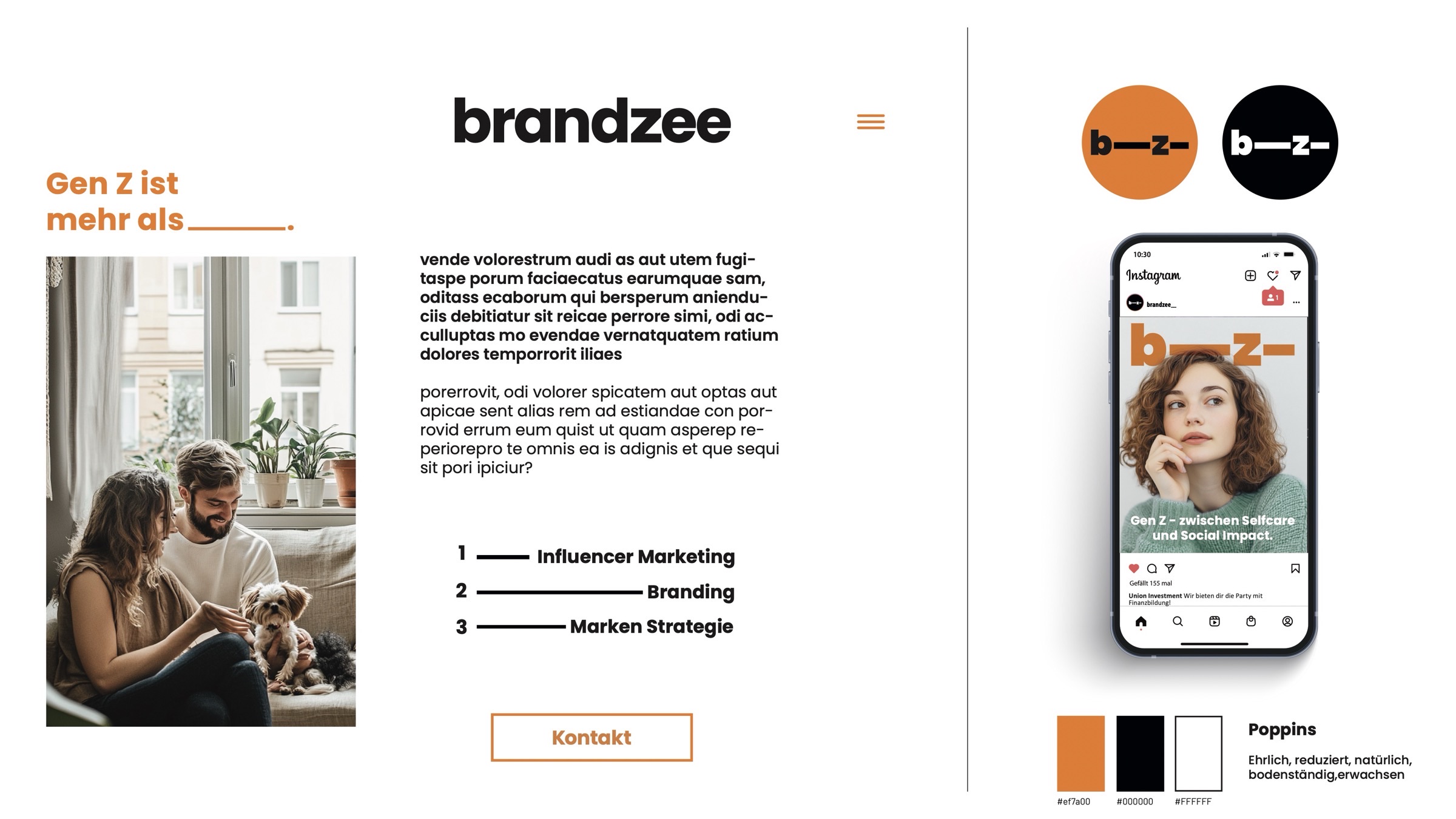
Honest and grown-up
Poppins in orange and black, calm editorial layout, the icon becomes a line: b—z—.
Shortlist
Three routes went into the next round, side by side as logo, profile icon and system. Route C won: the cut-off “zee” was the only idea that carried the name itself, it worked as a tiny icon, and it gave the brand a recognisable gesture beyond the logo.
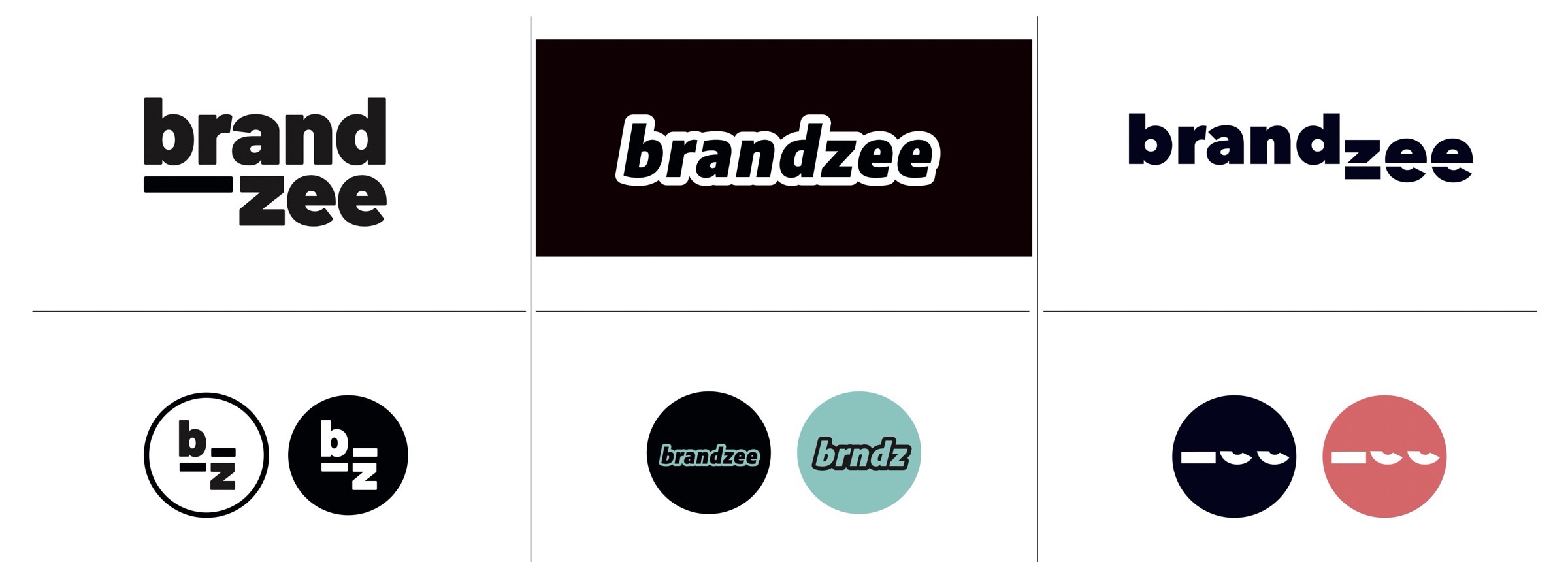
- ABold and reduced
- BLoud and retro
- CDynamic and intense chosen
Refining the mark
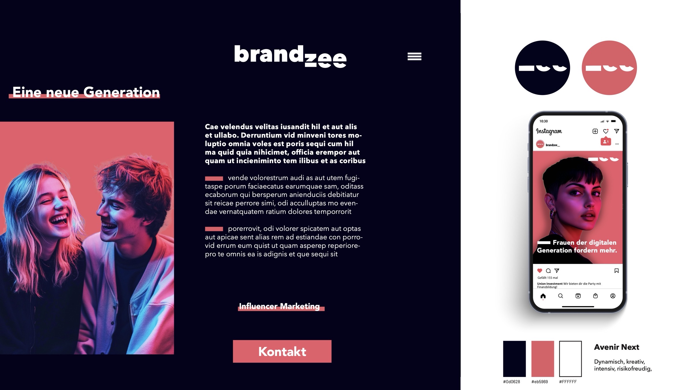
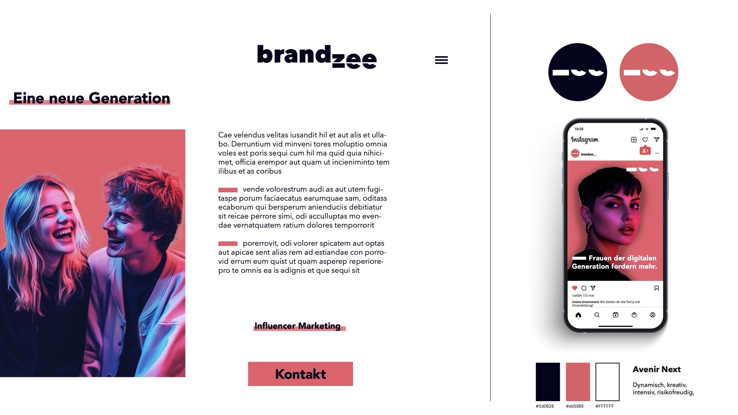
The gradient version felt too loud for client work, so the colours were pulled apart into a deep navy and a warm coral. The wordmark was simplified: “brand” sits calmly on the baseline, “zee” drops below it and is sliced horizontally. The cut became the brand’s signature, it reappears as an underline, a highlight and a graphic device. The system works in a dark and a light version, hover over the image to compare.
The logo
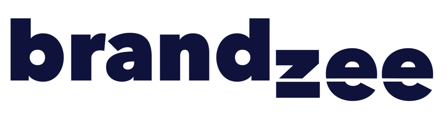
“brand” stands firmly on the baseline, “zee” drops below it. The line between the two cuts straight through the letters: brands on top, Gen Z underneath, and BrandZee as the connection between them. The heavy, compact letterforms keep it serious enough for B2B clients, the drop gives it the edge it needs for social media.
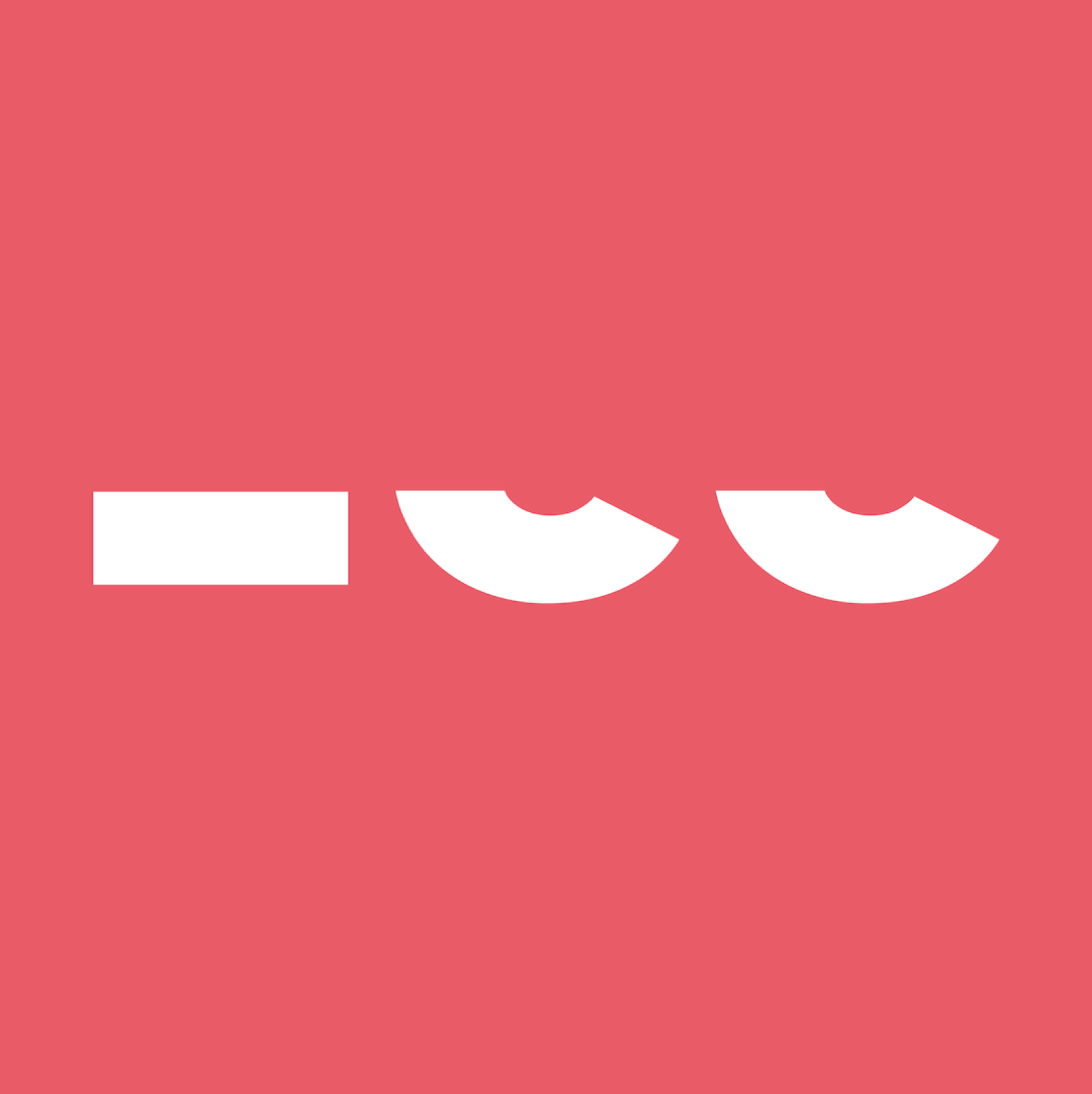
For profile pictures and small sizes only the cut “zee” remains: a dash and two half letters that read like a winking face. It is unmistakably BrandZee even at 40 pixels, and it works in navy, coral and white.
Colour and type
#0D0628#EB5969#FFFFFFAvenir Next
Dynamic, creative, intense, bold.
Outcome
Building on the identity, a LinkedIn campaign and a one-page website were created. The design was received overwhelmingly well by the people responsible. Even so, the identity was never rolled out at a larger scale: the use case for the website turned out to be weaker than expected, it did not bring in new clients, and in the end the project was not economically viable for Müllerritzrow.
What remains is a complete brand foundation, from research and routes to logo, colours and type, and a lesson I take into every project since: test the business case early, before scaling the design.